Visual Identity
CREST
 The location of the Catherine McAuley Catholic College is one of abundance of natural environment where river, lake, bush, ocean, dunes and wetlands converge. The Worimi people are the traditional custodians of the land where our community sits, with the landscape housing a large number of Aboriginal cultural sites that pre-date the arrival of non-Aboriginal people to the area.
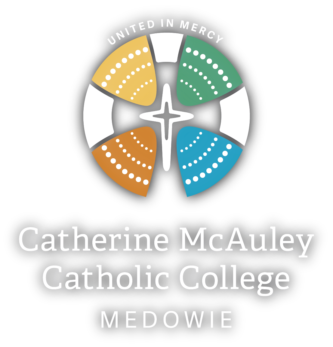
Our visual identity seeks to create a connection among the diverse groups that are coming together to form one, cohesive college community. The Mercy Cross sits centrally within the concentric circles of the crest. The use of dotted lines depicts a meeting place and draws links to the Worimi people.
Each colour references different aspects of indigenous culture, Catholic traditions and Mercy values: yellow depicts the sun and is the colour of Catherine McAuley; blue portrays the vast number of watercourses that dominate our local area; green presents the traditional meaning of Medowie – the place of tall trees; and orange relates to the bright clay ochre found in the area and used for ceremonial dances by the Worimi people.
MOTTO: "United in Mercy"
The motto “United in Mercy” honours the namesake of the college Catherine McAuley and the role the Sisters of Mercy have played in education within the Diocese of Maitland-Newcastle. It takes inspiration from Catherine’s life works, in which she was able to provide support and care for many people in need in her community of Dublin, Ireland.
The college will be the first Catholic secondary school in the Port Stephens/Myall Lakes area and will receive students from parishes within this region and those students who attend St Brigid’s at Raymond Terrace, St Michael’s at Nelson Bay and St Joseph’s at Bulahdelah. Catherine McAuley will unite these families as one faith community.
Catherine McAuley was known to have said: “There is that of God in every person.” The motto “United in Mercy” commits the college to becoming a central and vibrant hub for the Port Stephens community, building connectedness and solidarity among all.
COLLEGE CHARACTER CIRCLE
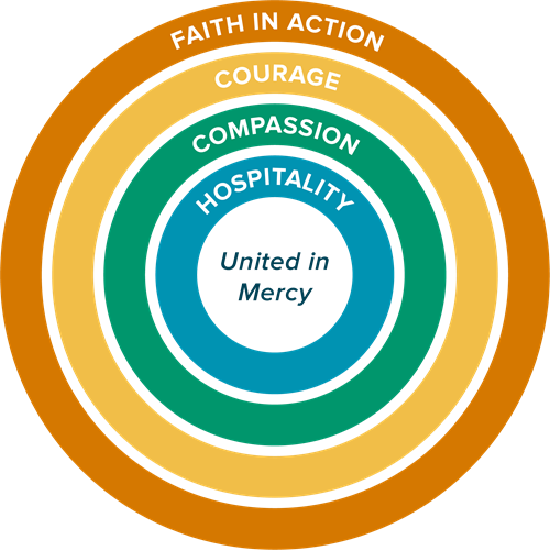
The College Character Circle combines four defining themes that guide the school’s “personality” and provides richness, depth and charisma. For CMCC, this comes from the values of Catherine McAuley and the Sisters of Mercy, the spirit and culture of an Australian Catholic school and the local environment in which the College is established.
The other powerful insight the College Character Circle delivers is that defining values sit in relation to each other. The simplicity of the diagram lets us see conceptually how each theme contributes to the identity of the College and where there is potential synchronicity, differences or emphasis on one area at the expense of others.
The use of a circle to diagrammatically display these themes links to three aspects of the college – the Circle of Mercy, the indigenous symbol for community and the design of the central courtyard within the school campus.

SYMBOLS + COLOURS
Inspired by the spirit of Catherine McAuley and the location of the college, the following list of symbols and colours form the basis of the visual identity.

YELLOW > SUN > CIRCLES
Bright yellow was chosen as the colour of the Catherine McAuley rose due to its radiance and delicate fragrance, reminiscent of the golden-haired and gracious Catherine.
In colour psychology, yellow denotes optimism, confidence, friendliness and creativity.
The Stockton Bight sand dunes form part of the Worimi Conservation Lands and are an important cultural site of the area.
The sun is a centre-point of Aboriginal and Torres Strait Islander cultures across Australia. Featured on the Aboriginal flag, the sun is the source of life and death. It brings life and heat to the people and in many Aboriginal traditions, the sun is a woman and the moon is a man.
The concept of the Circle of Mercy captures the spirit of Catherine McAuley and the themes of inclusiveness and God’s love.
In Aboriginal art, concentric circles denote a meeting place – a central point within the community.
In the design of the CMCC campus, the central courtyard is circular.
In popular culture, circles are a symbol of unity and togetherness.
BLUE > WATER > MERCY
In colour psychology, blue is a symbol of intelligence, reflection and calm.
Varying watercourses dominate the catchment area of the school including river, wetlands, lake, ocean and bay.
Water is a symbol of the Catholic sacrament of Baptism and is a sign of cleansing and purity.
A waterhole signifies an Aboriginal sacred place – where stories are passed down through the generations.
The Sisters of Mercy associate themselves with blue, marking the relationship with their patron, Our Lady of Mercy.
The Mercy Cross is based on the cross designed by Catherine McAuley and has a white cross in the middle of a dark-coloured cross. Catherine chose this to be the symbol of the Sisters of Mercy because of her deep love for Christ.
ORANGE > EARTH > FIRE
In colour psychology, orange indicates enthusiasm and warmth.
Many important ceremonies were held by the Worimi around the Karuah area due to the vivid red and bright orange clay ochre. This clay ochre was used for ceremonial dances.
Fire is a symbol of the strength and force of the Holy Spirit.
Fire is an integral tool for Aboriginal people in shaping the land for growth and hunting.
GREEN > TREES > MEDOWIE
Green is the colour most commonly associated with Ireland, Catherine McAuley’s birthplace. It links to the poetic name for Ireland, Emerald Isle, due to its green countryside. It also links to the early Irish Catholics who wore green as part of their rebellion against the British crown.
In colour psychology, green represents harmony and balance.
Medowie means “the place of the tall trees”.
The “Fishing Tree” was used by generations of Worimi people to find schools of fish near Bagnalls Beach. The tree stretched out over the water. A finder would climb the tree and look in the water for fish and direct people in canoes to the best fishing spots. Footholds can still be seen along the trunk. Living on the coast and by lakes, the Worimi relied on fishing and made canoes out of stringybark trees.
Trees, leaves and seedlings are symbols of nurturing, growth and thriving.
